Jumat, 29 April 2011
Country Kitchen Furniture
You’ve seen the photos...cute little country kitchen with red checked, ruffled gingham curtains at the windows, rooster collections on every windowsill, oak kitchen table and chairs with matching hutch in the corner, braided rugs on the floor...all we’re missing is the fully clothed faux goose. Oh, there he is...on the porch.
No intention to offend, but the cutesy days of country are pretty much over and done with. If you love it and that is your lifestyle, kudos to you! For most country home decorating lovers, though, interpretation of the style has moved up a few notches into the 21st century.
Traditional and Cottage Country kitchen furniture will always exhibit at least some of these timeless characteristics:
Casual...A true country kitchen will always have the ‘come on in and sit awhile’ flavor to it
Distressed...Here’s one of the great aspects of cottage and country style furniture - it loves everyone’s budget.
Painted...Your table might be light oak, chairs painted a distressed pewter with deep red seat cushions, a buffet that echoes the chairs, mirror above it in light oak...you select the color scheme
Mix and Match...Not only can colors be combined, but remember that you don’t have to use all wood pieces in the kitchen.
Variety of Shapes...Your country kitchen furniture does not have to consist of a rectangular farm table and straight back dining chairs
Want to know more? Read all the details about Country Kitchen Furniture
Til next time,
Candi
Kamis, 28 April 2011
Wall Decorating Ideas
No need to stress out over wall decor...just follow this process and the ideas presented here...you’ll be fine!
There are three main considerations for determining the right wall decor for your home:
The first step is to make sure that your walls themselves are in order, meaning, do they need some color?... decorative trim such as crown molding?... practical trim such as shoe molding? ...a really good cleaning? Take a good long look and make sure your walls are ready for those decorations.
Next, have a good sense of your decorating style for this space, as that will influence your wall decorating ideas and selections.
For example, if contemporary home decor speaks to you, then you will definitely utilize the ‘less is more’ strategy for your wall decor. You might select one dramatic piece of art (doesn’t have to be an expensive original to be great) for the focal point wall in the room.
The third important consideration with wall decorating ideas is the room function itself. This may seem obvious, but sometimes we get caught up in how much we adore a particular picture, for example, and forget about the space it is going into.
If your wall decorating ideas are for the kitchen, for example, make sure they are appropriate for the space. Having said that, I am all for being creative and utilizing artwork and wall accessories in ways that are unexpected, so I am not advocating the typical picture collections of fruits or spices, for example.
Just make sure that your selection is compatible with the room function, fits the color palette for the space as well as the decorating style you have chosen.
Read more specific ideas and tips for Wall Decorating
Rabu, 27 April 2011
Patio Decorating
Your patio, deck, back porch or lanai can be a useful and enjoyable area of your 'extended' home. And, why not? Whether you live in a climate that allows for limited use or year round function, the patio is an area that you really don't want to go to waste, particularly if you live a climate that remains warm enough for year round use.
So how do you go about addressing the patio decorating project? There are some questions that you need to answer that will help you define and refine how to proceed.
First, what is the size of your patio? Is your area open, covered or enclosed? what types of activities do you want to be able to do on the patio? And, what is your budget for decorating the patio?
Knowing your budget in advance is also an indication of where to shop. Higher end patio furniture store, budget minded department store or a source such as a flea market or craigslist.com...put a plan together!
Okay, you have the planning part of the patio decorating project under your belt, so now it's time to think about the actual decor. The patio is really an extension of your home...what is your decorating style?
For example, if your home is Casual Country, continue that theme with your patio decor. Bench seating, table/chairs, deck chairs, etc...whatever you are searching for, make sure that the style will suit the interior of your home.
Read all the details plus more great ideas for Patio Decorating!
Selasa, 26 April 2011
What About New WAIsite?

WAI presents www.waithinktank.com
In order to make our content available in China, and set another concept for the display of the content of the think tank, WAI welcomes you to visit www.waithinktank.com.
The new website presents the projects and articles of WAI to a broader public. and it will work as the sister site of wai’s blogspot.
Decorating With White
But, use it as a method of decorating and design in a room and you feel the 'presence' of the light.
Whites and off whites can be used almost exclusively in a room, and, when splashes of color are applied sparingly, the whites take on a focus and personality of their own.
Gone are the distractions of multi colors and patterns, so each muted piece, texture, shape and shade of white can be fully seen and appreciated. Should you add some color to a room that is has been decorated with white? That is up to you, but consider introducing a subtle touch of color.
Your selected color(s) could be found in a table arrangement, a picture frame, as a pattern in an area rug, collectibles on display, flecks of color found in a carpet, artwork on the walls, a lamp base or shade, to name a few.
What colors look great with white? When decorating with white you can add just about any color and it will look good against the neutral backdrop of the room.
Mix white with lavender and gray and you’ll get instant glamor. White and black, instant drama. White and yellow, instant chic. White and blue, instant freshness.
Read more about Decorating With White
Have a great day!
Til next time,
Candi
Senin, 25 April 2011
My Design Closet
Minggu, 24 April 2011
Happy Easter
Jumat, 22 April 2011
Home decorating trends
 current trends in home decor is the best way for the reproduction of the famous artist (who is not a great cost for purchase, especially in poster art has been regularly up to the standard size paper or canvas Rather could not screen but you especially when it was not the Father as expensive as the original.) Fantasy And no, or only certain components of high quality arts such as bamboo, shells, stained glass, fake wood finish because you can invest in, marble and stone-framed mache is not about appearance at work, inside art and borders. You can also choose the background paper replica of a mountain of work that paints a portrait of a still life or well-known role or come to the nature of innovation is very interesting in his painting, a picture that is more attractive visually. professional interior designer, has also recommended that the edges of the welfare of the old manual, ribbon and scalloped on the border of self-selected along with all registered well before the drafting and assembling the framework of its partners, slender and graceful style of classical times simpler to find the mixture to use.
 If you choose to frame the art of landscape, a series of art prints on the walls that are not available in many styles, some country artists, but about the size so that they reach the wall or just go to the field where you can choose a piece of minimalist monotone effects of the wall is a piece of black rural folk art. Sepia image of a landscape can also tell the story through art and posters were selected in a particular way, since the appearance of 4-8 the same size as the wall until you go to an established pattern of a square, rectangle or zig-zag. It is important to remember if your furniture to the wall with the selection as a senior and heavy furniture, cabinets, or a piece of time that more attention be eliminated, especially the posters, decorative prints on the walls as space created by this activity. Also, try to take the walls of the room, which can maintain the dignity of others. French country theme room with flowers of light, the sharp, natural fiber for furniture and lighting, landscape design as a peaceful country, which will help tie all their own decorations to reflect the seriousness of the artwork. Van Gogh, Monet, Rembrandt and Picasso art large poster, since low-cost, high fashion and interviewed each boot - living room, dining room and the wall art flowers, seasonal gardens to choose from, or in addition to posters art by great masters win for Home decorating trends.
Modern interior design trends
 Interior of your bedroom is a feeling of relaxation. Let us suppose that a platform bed that is not decorated with ornaments and header. Rectangular tables and beds should be low to the ground. There is a tendency to accent lighting silver metal, but you get much more interesting colors and designs. I am a quiet and natural colors of walls and slabs. decorative pillows, and decorative pieces for your form, the perfect color. The soil should be clean and elegant. Wood flooring has a better appearance. Remember that the goal is to create a place to relax, so that no room is filled with too many items. show also show a sense of comfort. Sofas and chairs should be smooth and soft. Bank does not support the illusion of more space, and the same goes to the bench without arms. Sectional is a great way to share your space. To prevent large materials and substances. Leather and microfiber works best. Black color of the modernists has become the perfect opportunity. On the chair, because you can choose to fine leather, or something more character over. Some look quite comfortable than the chair of the visual arts. In the kitchen, stainless steel appliances within the government to the highest design. Kitchen and dining table chairs without arms, and perfectly square or rectangular. The house, designed by a lack of rest as a luxury. Lunch is usually white and square. If there is usually no line in the model.
Home interior design trends
 Furniture and accessories you design a new space for homeowners to get practical information, like you, and the search interior design blog created by the owner. Links to the kitchen cabinets, beds, cassette only for the economy will definitely notice the design recommendations. Also, find links to where you need furniture, low prices. The most important is the actual person who tried to approach the design trend. such as Cosmo Worlds is also a great source of ideas when the design trends of the Interior. Business where you can get your furniture in your favorite city or country will know, your advice and are not willing to make good time. If a modern classic will be able to enjoy, or choose to enter some old pieces of contemporary design, this is without a doubt, ready to visit a place of inspiration for their furniture to buy. Personal ornaments, including fountains table fountains and wall elements, nice quiet, and served as artistic. In addition to water sources, impact on your interior design firm, to adapt to the simplicity and elegance.
Interior Paint Trends
 Today, many people with solid color paint, and furniture and artwork to draw attention to their room. great pictures, large mirrors and large-format paintings are very popular. Oval or round bathroom mirror, flat mirror, a large plaza to replace them. dark colors like chocolate brown, white or white and paint all the woodwork inside the house renovation, and considered very popular. Accent walls are still popular, and a large network in question. It is amazing how many times the trend has changed and how to change the interior design. I felt great when I went into the house is not updated that year. This is not a house built in 1958 was updated recently since I went. The house was very clean and original. Some retro look and feel like a home to as retro. Everyone loves this house included. Perhaps we have made a full turn of the trend in the design of the Interior. I always like the old adage "the only constant in life is change." It is always interesting to see what venda.
Rabu, 20 April 2011
Easter Egging

Senin, 18 April 2011
Jumat, 15 April 2011
What About the Avant-garde, Megastructures and Shopping Malls?

Megastructures are Shopping Malls of the Avant-Garde
Avant-garde
The avant -garde is a paradoxical state. In order to exist, it relies on its incongruous condition of being both fundamentally contemporary and ahead of its time. The avant-garde is all about contextualizing perfect timing; a vulnerable balance of past references, present problems, and possible future solutions. But what happens when the avant-garde loses its synchronization; when its solutions are overlooked for being too early or ridiculed for being too late?
In the past century the avant-garde was victim of two untimely appearances. In the first one its proposals were too premature; the world was taken aback by the boldness of its ambition. In the second one, the avant-garde was delayed. Here its stratagems were on a futile mission of reinventing what already existed.
Do these two consecutive setbacks prevent us from recognizing the potential of the avant-garde as a tool to design for today while dreaming about tomorrow? Or could we be able to learn from those two episodes in order to rescue whatever the avant-garde has to offer us? Can we rescue their potential? Can making a genealogy of Foucaultian dimensions help us to find the answers?
Le Corbusier 1922
In 1922 Le Corbusier presented the first of his “ideal” cities. La ville contemporaine pour trois millions d’habitants was an urban layout of cruciform skyscrapers, housing slabs and parks intersected by two juxtaposed grids of car infrastructure. In his urban plan Le Corbusier was not only manifesting his ambition for a greener, denser, centralized, bureaucratic, car oriented city, but he was also making clear that Modern Architecture was better suited for these planning conditions.
The Ville Contemporaine was siteless; a power source without an outlet. When the modernist plans started to take shape on real cities, first in Paris with the Plan Voisin, then in the rest of the world with la Ville Radieuse, the image of Le Corbusier oscillated between a visionary and a madman. His preoccupations were clearly fundamental problems of his time, but the formalization of his ideas were not always welcomed. Even if the cities of his time could have needed more hygienic and organized schemes, buildings that were more suitable to live in, collective housing that distanced itself from the Haussmanian family flat and an overall vision that complied better with the new technological advancements, the people were not ready for Le Corbusier.
His cities were not the only ones to find an intense opposition as his ideological postures found fierce resistance as well. The core urban values of travailler, habiter, circuler et cultiver le corps et l'esprit, adopted by the CIAM and integrated in the Athens Charter (1933), turned out to be the focus of attacks after the Second World War broke out in Europe and left the urban and social situation in a much worst and urgent condition than the one that Le Corbusier had rebelled against in the 1920’s.
After evidencing the destructive side of modernization (of warfare), the social and economic conditions at the end of the war put under harsh scrutiny the urban plans which wished to bulldoze the old city centers away. The love for the old city was politically reinforced by the collective memory. With this situation in the background, a young generation of architects willing to continue to explore the possibilities of the modern plan (Team X being one of them) wished therefore to distance themselves from the highly criticized urban visions of Le Corbusier. The war with its obliterating outcome not only represented the destruction of the old-European world, but marked the meltdown of the urban visions of Le Corbusier. After the war a halt was put to the avant-garde and its city, at least on European soil.
Bifurcation 1956
The year 1956 saw three distant but simultaneous events that marked the fate of the avant-garde for the remaining of the 20th century. Unfairly overlooked, these events characterize a key moment in the development of the avant-garde that could be used as a tool to analyze the present, create a critique on the past, and dream about the future.
More than thirty years on from the creation of the Ville Contemporaine, the now officially defunct (who can forget Team 10's practical joke on the CIAM?) “old” avant garde was being given its first full-scale urban experiment in Brazil. At that very same moment, in Europe a “new” avant-garde movement was preparing its (ultimate?) attack on the modernist city unaware of a phenomenon that was taking place in America and that was to signify not only the antithesis of their architectural agenda , but a devastating blow to their aspirations for a new city with a new society.
Brasilia 1956
In 1956 Brasilia started construction. The then Brazilian president Juscelino Kubitschek orchestrated the creation of the new capital with the construction of the first government building by Oscar Niemeyer, and with the “Plano Piloto de Brasília” competition which was won by Lucio Costa a year later.
Anchored on a virgin site, Brasilia was the apotheosis of the modernist city; the ultimate opportunity to develop strategies of urbanization without needing to bulldoze old cities away; the new start that planners always dreamt about. Was Kubitschek the client Le Corbusier always wanted?
At first sight Brasilia was to make its aesthetics recognizable under the modernist inspection lens. When talking about the Brazilian capital the spotlight tended to shift to the features of Niemeyer’s concrete monoliths and radically thin slabs. But a closer inspection of Brasilia reveals an even deeper connection with the Le Corbusian city: the layout with its centralized government, its concrete housing slabs, its grid of streets and avenues, and with the years, the park within city –all the vegetation and trees— not only appear so strikingly similar but reinforce the belief in the city of the four values. Finally, Modern Architecture in a Modern City.
Was Lucio Costa Le Corbusier’s Brazilian translator? Or was Le Corbusier’s avant-garde dream unintentionally designed for Brazil? Was his image of the city of today meant to find consecration someplace other than Europe? Was he imagining his cities somewhere where the collective memory wasn’t as infatuated with the past? Was his architecture giving him away all this time—the pilotis, the garden roof, the horizontal window, all so suspiciously
tropical?
New Babylon 1956
In 1956 Constant Nieuwenhuys was working on the antithesis of Brasilia: the New Babylon. While the first urban avant-garde was dispatched from the Post-War Europe, and re-launched as poured concrete, and asphalt in Brazil it was in Europe again where a “new” avant-garde was to set its second attack on the contemporary city; on this occasion with a different outcome.
This new model for urbanization was comprised of an ever-extending, ever-mutating series of sectors that were to hover above the old European cities. New Babylon was an urbanistic black hole; an ever expanding mass able to suck everything into designed disorder.
Using automation as the tour de force of the new city, New Babylon was to abolish the four points into which the Le Corbusian city was supported. If Brasilia was centralized, bureaucratic and pre-programmed, New Babylon didn’t have a center, possessed no cars, and its people needed no recreation since there was no need to work. New Babylon was the apotheosis of the laissez-faire lifestyle, an Eden for drifters.
In the New Babylon even environmental conditions like daylight were to be abolished, giving the new inhabitants of the new city total freedom to drift à la dérive. The first proposal of a naively energetic avant-garde, the New Babylon was putting all its energy on creating a structure (and a society) into which somebody could wander about without having anything to do. New Babylon was perhaps the first of the Megastructures; colossal complexes that could mix programs and be developed ad infinitum, architectural plankton accumulating in the urban ocean.
Megastructure 1956
Like the New Babylon, several other Megastructures were about to dominate the architectural scenario with their conceptual strength reinforced by their representation strategies. The use of Xeroxing, photomontages, comic strips and short films were part of the visual repertoire of a group that looked to break away from the modernist dogma not just in conceptual terms but graphically as well. Hybrids of science fiction and cyber punk aesthetics, these new structures defied building physics, and sociological preconceptions. No wonder that these mastodons could float, walk and be suspended above the old cities of Europe.
The “new” avant-garde gambled on the narrative power of their new tools, as they went to create stories about their hovering superstructures and their ability to expand and mutate forever, their capacity to challenge the lifestyle of the modernist dogma and control the environment. But while the representation strategies of the “new” avant-garde raised eyebrows because of their innovative nature and because of their ability to integrate pop culture into it, their prophecies of a new architectural program and urbanistic ideal were to suffer a devastating blow coming partly from that same pop culture that they took their graphics from.
Or, Coexistence of Shopping Malls?
Southdale Center 1956
In 1956 Victor Gruen’s Southdale Center, the first air conditioned enclosed shopping mall, opened to the public in a Minneapolis suburb. The building was the first of a series of structures that—like the Megastructures—were to create an artificial environment that would free the users from the complications of the city. Free from bad weather, crime, dirt, problems, the shopping mall represented the ultimate achievement of commercial architecture; the apotheosis of consumer culture; a new type of facsimile reality enclosed in a cluster of walls and juxtaposed corridors. Soon these programs would mutate –like the Megastructures promised to do—and include all kind of uses, from theme parks, to museums, to housing, working, and recreation in a kind of forced marriage between Le Corbusian functionalism and New Babylonian dreaminess.
Was Victor Gruen the architect New Babylon needed? Or was New Babylon the Shopping Mall of the avant-garde? How can the ultimate capitalist enterprise coincide with the ultimate Marxist project? Was the “new” avant-garde dreaming about what the most commercial of enterprises was already achieving? Or, was the “new” avant-garde trying to use their flashy pop-graphics and cartoonesque diagrams as stealth —under the graphics, the mall?
If the proposals of the “new” avant-garde were not as radical as they suggested, would we still be able to learn something from them? Are their graphic representation tools the key to this enigma? If the architectural program isn’t what made them avant-garde, is it their graphics that set them apart from the pack? Were they really answering problems of their time and opening a new future? Or were they just leaving us the key for us to figure it out?
Après-Garde
In this double clash of avant-gardes (the “old” versus the European city, and the “new” against its American antithesis) we come to identify at least two possible outcomes that could throw light over how to develop strategies for the unknown future. These episodes with their unique characteristics show both sides of very precise moments in the development of the strategies of the avant-garde and their potential outcome (some recognized, others ignored).
In the first conflict, a battle with the contemporary city that was won long after the fight was apparently over, gave validity to the avant-garde strategies of Le Corbusier even if its cities were never built. Le Corbusier’s designs for today provided the answers for the city of tomorrow.
However, in the second, the situation turned out to be more critical for the strategies of the new avant-garde after their architectural program turned out to be hoax. Because of the outcome of their ambitious architectural enterprise, the value of their strategies has been overlooked, even undermined.
Howeve, could we make an exception with the proposals of the “new” avant-garde and, in contrast to Le Corbusier, judge them not by the content but by the medium? Are we prepared to acknowledge that the potential behind the hangars, and sectors of the Megastructures was hidden in the graphics that displayed them?
Could we then, instead of condemning the “new” avant-garde to the sterility of museum walls and architecture publications, discard their programmatic naivety, and recognize their potential as powerful tools of representation?
Are we prepared to take the risk and assume the role of the avant-garde, and create proposals even if they are not going to be accepted from the beginning, and develop tools that may end up portraying recycled models of urbanization? Because at the end of the day, as these stories prove, the avant-garde was not always right, but it was, and it will remain just a beginning.
Rabu, 13 April 2011
What About Revisiting the Zone?

Wall Stalker featured in DPR Barcelona
While WAI works in the upcoming second and third part of the animated narrative architecture series, a post about Wall Stalker can be read in DPR Barcelona (César Reyes Nájera and Ethel Baraona Pohl).
Revisiting the Zone presents Wall Stalker within a series of works from other artists inspired either by Arkady and Boris Strugatsky’s Roadside Picnic, or by Andrei Tarkovsky’s Stalker. The animation of Wall Stalker can be seen in Vimeo and YouTube.
Wall Stalker can be read in the WAIzine, in Designboom and in WAI.
Selasa, 12 April 2011
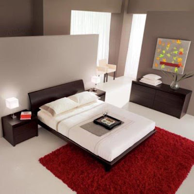
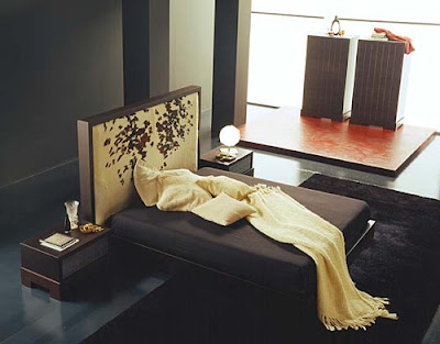
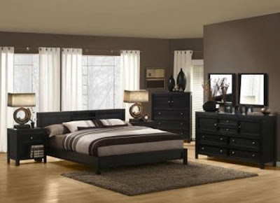
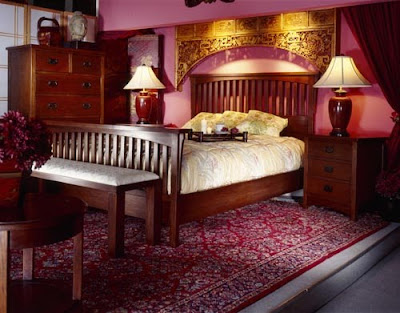
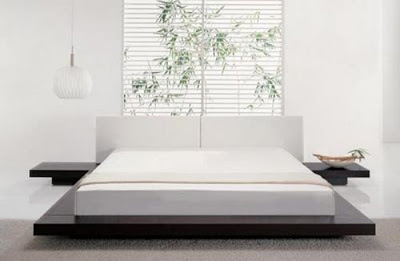
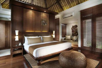
Asian Bedroom Furniture | Bedroom Furniture
Asian furniture is generally low and that comes in dark colors. Black and earthy brown are the best tones to have in the Asian themed bedroom. You can also opt for bamboo furniture, that is perfect Asian inspired furniture. If you have green colored walls you can have this bamboo furniture to add pale yellow or earthy brown tinge to the room. You can have very dark brown colored wooden cabinets and wall shelves to match the red and black color scheme. You can also add off-white cabinets to balance the dark tones. Getting Asian inspired bedroom sets is a wonderful idea. These will have classic beds, cabinets, side tables, wardrobes and dressing tables, all perfectly matching the theme and with each other, as well.
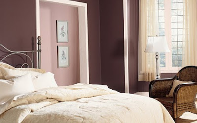
Color Scheme for Bedroom Decoration
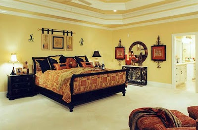
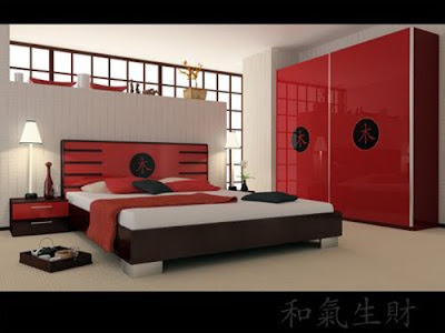
It's fun to add colors to the bedroom when you are working out an Asian home decor. All those dark shades which you kept wondering about, to have your walls colored in, can be used now. Red and gold are the best colors to have an Asian inspired bedroom. Dominant red with a border or some stylish stripes of golden can give a dramatic look to your bedroom. Finishing the look with off-white furnishing with golden or red prints is a great idea. You can also have that lush green or softer green to have a cool effect. Again a yellow and green combo will look superb. Another wonderful idea to design Asian inspired bedroom is to have red and black or red and beige color scheme. Believe me, this looks just awesome. It will give a lively feel to the bedroom. Having semi-transparent red and black striped floor to ceiling curtains is a good idea.


